 |
"Golden Moment"It's Day 5 of Walking in the Winter Wonderland: 10 Days of snowscapes and winter related paintings.
Today we are hitting the slopes with Lindsey Vonn, who is in the news again after finishing second in a World Cup super-combined race in Val D'Isere, France.
This is a pastel painting based on a photo of Lindsey after her Olympic triumph in 2010. I was preparing to teach a pastel class at the Y Arts Studio, and hadn't worked in pastel in a while, so this was my refresher piece.
You can read more about it by clicking on the related post.
Related Posts: |
Saturday, December 19, 2015
10 Days of Walking in the Winter Wonderland, Day 5


Friday, December 18, 2015
10 Days of Walking in the Winter Wonderland, Day 4
 |
"Twosome"It's Day 4 of 10 Days of Walking in the Winter Wonderland!So for those of you who can't get into the Christmas spirit without a covering of snow on the ground I am presenting 10 days of snowscapes. And as promised here are the Cardinals.I'll bet you were expecting this painting: |
"Twosome" was painted for Associated Artists Holiday Show "Off the Wall", which gives customers the opportunity to purchase a painting and take it home that day instead of waiting till the end of the show. "Twosome" sold during the first week of the show so I guess I am not the only person who like cardinals.
Both paintings were done in watercolor, using crinkled plastic wrap on the wet surface to create a texture. When the plastic wrap is removed it leaves behind a random textured pattern of lines and creases which can be used as is, or enhanced with more pigment to create a sense of depth. The sky in "Twosome" has touches of yellow to add warmth and the feeling of a bit of sunlight peeking through the clouds. The sky in "Cardinals" is definitely a winter sky; much colder although there is a very small bit of yellow and alizarin crimson to warm it up here and there for contrast.
You can read more about this technique by clicking on the link to a related post below.
Related Posts:
http://joanapplebaumart.blogspot.com/2014/12/for-birds-adding-life-to-subtle.htmlTomorrow: We're going skiing! (in our painting) I'll meet you at the chair lift!
Thursday, December 17, 2015
Joan Applebaum Art: 10 Days of Walking in the Winter Wonderland, Day 3
 |
"On the Eagle Marsh Trail"It's Day 3 of Walking in the Winter Wonderland!
So for all of you who can't get into the Christmas spirit unless the ground is covered in snow, Windy Hill Studio takes you "On the Eagle Marsh Trail".
A few years ago my husband and I took a winter hike with the Indian River Lakes Conservancy in the area near Butterfield Lake and Lake of the Woods. It was a mild day with just enough snow to make the scenery interesting. Since the snow covering was sparse we were able to view moss and other hearty vegetation along the way. (The following year we hiked with the Conservancy in freezing cold weather and continuous snowfall which was a much different experience!)
The trail went through the woods, around some interesting rock formations and eventually led us to a spot where if you looked very closely you could spot an eagle's nest.
After hiking back to the beginning of the trail we were treated to hot chocolate and s'mores as we gathered around the campfire.
Painting the Eagle Marsh Trail
One of the things I liked best about working on this painting is the opportunity to add other colors to the winter landscape. The warm colors of the green moss and red-brown dirt provide a nice contrast to the cool winter colors in the snow and in the background. The colors of the trees in the foreground were made by using all of the other colors in the painting in various amounts; sometimes mixing, sometimes using straight from the tube, creating a series of lively neutrals instead of pure brown or gray.
The trees and sky in the background are painted in cool blues and purples which recede and create a sense of distance.
What's in store for Day 4? It's time for a touch of brilliant color so tomorrow I'll feature the Cardinals!
I have 3 different cardinal paintings, so I'll keep you guessing as to which one will be spotlighted as we continue Walking in the Winter Wonderland.
Related Posts:
|
Wednesday, December 16, 2015
Joan Applebaum Art: 10 Days of Walking in the Winter Wonderland, Day 2
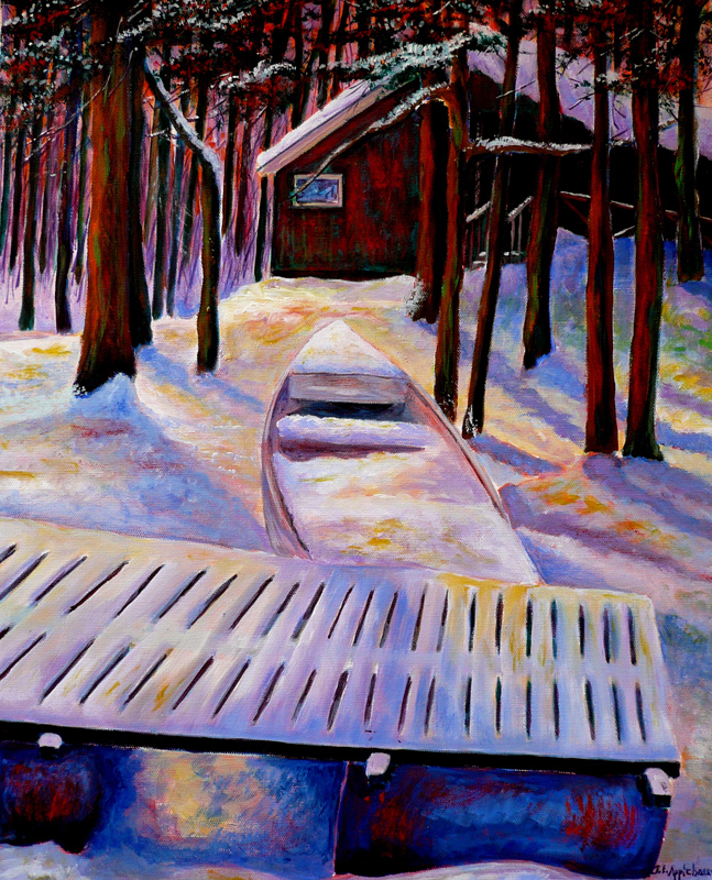 |
| "Wintering" |
It's Day Two of 10 Days of Walking in the Winter Wonderland! And still no snow in sight around here.
Today's painting "Wintering"comes from camp, and it's the second time I have used it in a blog post.
While on a winter hike around the lake we came upon this camp nestled in the trees. The sunlight pouring through the trees and casting long purple and blue shadows convinced me that the scene needed to be painted. And I loved the pattern of snow on the dock and the big blue barrels holding it up! I took a few photo references and began the painting a few days later.
While working on the painting I was fairly faithful to the color of the camp--mint green, but later changed the color to a red brown. The mint green was throwing off the color harmony and the composition by drawing your eyes directly to the camp instead of the foreground which I felt was much more interesting. I did leave a bit of the mint green color which glows through the red/brown here and there if you look closely at the painting.
Tomorrow we head to the Eagle Marsh Trail. See you then!
If you missed Day 1 you can click on the link below
http://joanapplebaumart.blogspot.com/2015/12/joan-applebaum-art-presents-10-days-of.html
Related Post:
Tuesday, December 15, 2015
Joan Applebaum Art Presents: 10 Days of Walking in the Winter Wonderland
 |
| "Winter" |
Where's the Snow?
We're having a warm December here in Upstate New York, so for those of you who just can't get into the Christmas spirit unless the ground is covered with snow, I am presenting 10 days of winter landscapes. Or should I say Snowscapes?Our first painting is titled "Winter". Yep. Real original. But the painting itself is an experimental watercolor.
I used salt create the starburst effect and cool colors to give a brittle winter-y look to the painting. The white-ness of the branches was enhanced with opaque white paint.
This painting reminds me of walking along the camp road on winter days so cold that the snow squeaks under foot. You can almost hear the branches creaking as they sway in the icy wind.
Come on back tomorrow for another Snowscape!
Thursday, December 3, 2015
Tis The Season for Everything Happening at Once!

It's December and Tis the Season for everything happening at once.
I have back to back events this weekend starting with the Holiday Gift Fair at Nature-Tyme in Syracuse on Friday from noon to 7:00 pm, where I'll have an assortment of prints, cards, Woodlands and Waterways calendars, art-to-wear and Cardinal mugs. The mugs come with a surprise inside---ok it's chocolate and I just might eat it all to keep my energy up enough for my next event!Which Is:
My show at Auburn Unitarian /Universalist Society!
I'll be hanging the show on Saturday; opening reception on Sunday after the service from 12:00 - 1:00
Auburn UU is located at 607 Seward Ave. in Auburn NY.
And here is the artist statement and a preview of the show:


TO EVERYTHING THERE IS A SEASON
If you are a painter, painting the seasons just seems like a
natural thing to do in Upstate New York. Living here we are greeted with an
ever-changing palette of colors as the seasons shift.
The year begins with wispy whites shimmering in the pale
winter sun. Spring brings us delicate green tendrils curling up from the
ground. At last!
Summer is glorious and filled with color. Flowers, fruits,
blue skies and sunny days! Ah, we wish that it could last forever! Fall is
glorious too as trees show off their “Sunday best”, their color rivaled only by
the brilliant orange pumpkins.
And then the sky grows heavy and leaden, and the bare
silhouettes of trees settle in for their long winter nap.
And the cycle begins again.
I hope to see you at once of these events this weekend!
Joan
Sunday, November 29, 2015
Not all Birds Head South for the Winter!

Not all birds head south for the winter
In fact this bird will be traveling east to his new home in Hull Mass. This is a commissioned piece, recently completed, approximately 24" x 30" with a wrap-around canvas. The painting is based on a stunning photo in which the play of light and dark in the shallow water create as much interest as the heron itself. In fact the background was just a little too interesting to transfer successfully from photo to painting.
Taming the background
When I began working on this painting I knew the biggest challenge would be in making the heron stand out from the water. In the photo the heron is nearly the same colors as the water, providing very little contrast, which is fine for the heron who is trying to blend into his surroundings. But we want something different in a painting. A painting needs contrast: opportunities for brilliant colors to glow against subtle colors, and light colors to shine against dark tones.
After sketching the heron and some of the major patterns in the water, I under-painted in complementary colors to give the painting more "life". Underpainting in complementary colors lends a fuller, richer look to the finished painting, especially when some of the under-painting is allowed to show through create a nice dynamic tension to the surface.
I painted the water first, then painted the heron adjusting colors and values to contrast with the water. The color of the heron in the painting is "amped up" and definitely darker in value compared to the heron in the photo. The lines around the feathers are more prominent than they are in the photo and are painted with high contrast to add definition and texture. I increased the orange-y rust color around the neck for contrast. The warm orange/rust comes forward and the cool blues recede.
Glazing
When the painting was nearly finished I mixed a combination of glaze with soft blues and purples (very little color, mostly glaze) and painted it over the water to further subdue the background. It worked!
As I was working on this painting I kept finding so many "lessons" within the piece from start to finish and it made me wish I was still teaching. We'll see how long my teaching hiatus lasts!
Title?
I haven't thought of a title yet. any suggestions?
Related posts
If you are looking for more information on working with underpainting in complementary colors, check out this related post from a couple of years ago.
Subscribe to:
Posts (Atom)