 |
Dunes: The Point, Cape HenlopenNew Beginnings
Well I stretched out my summer at camp for as long as I could. The wonderful lazy mornings drinking coffee on the dock, long walks through the woods and along the country roads, boat rides, endless kayaking, fun with lake friends, lots of company, teaching and working gallery shifts in beautiful locations along the St. Lawrence River and Lake Ontario have all come to an end. Sigh. It was wonderful--even with the bugs, pesky raccoons and porcupines and working in a very small studio space. Windy Hill Studio North is really just half a bedroom, but I was able to produce several watercolors, four acrylic paintings (3 of which sold) and many hand painted silk scarves which also sold very well. Sales of watercolors were also quite good so all in all it was a good summer.

Now I am down here in Lewes, Delaware ready to begin a new adventure. I have spent a little time down here in the last two years so I've done a few paintings of the area. The beaches and lighthouses are lovely and I'm sure they will be a source of inspiration just as the lake has been.

The town of Lewes with its quaint buildings, abundant gardens and picturesque waterfront will also provide plenty of material for a painter!
 New Studio
My new studio has plenty of workspace, lots of storage and good natural light. The addition of a task lighting over the workspaces lets me work in the evening and on overcast days. My two studio assistants Tony and Amy have ample room for getting into trouble or just napping in the sunlight.

So now it's time to get down to work. I will be updating the blog regularly as I begin to explore and paint a new area!
|
Showing posts with label watercolor. Show all posts
Showing posts with label watercolor. Show all posts
Tuesday, October 16, 2018
New Beginnings


Saturday, August 4, 2018
Searching for a Focal Point
 |
"Up with the Birds" watercolor
Often when I am teaching a watercolor class a wash technique I end up with a number of watercolor "backgrounds". Often I am able to develop these demo pieces into finished paintings. The backgrounds are generally soft colors subtly blending into each other to create some type of backdrop for a landscape painting. This background was done in warm reds, purples and yellows; my intention was for the class to create a sunset type of painting. Since many were beginners and hadn't had much drawing experience I encouraged them to work with the idea of a silhouette against the sky. No details, just shape. Keep it simple.
My demo piece had the three colors pictured above blending subtly, but it needed something else to give it some interest so I dropped bits of yellow paint onto the wet paper and let it spread. After the paper was dry I added the silhouette of the land with a few stray weeds waving in the breeze. The end result is this painting below, a soft rather dreamy end of day (or is it the beginning of day?) landscape.
|

Focal Point?????
But I felt like it needed something else. Like maybe a clear focal point. The weeds seemed to be the focal point, but I felt that the sky provided a space to hold another shape or two-- or more (remember, I'm working with silhouettes). So I added the outline of five birds in flight. And then a sun or moon shape coming up (or down) over the horizon. One more layer of vegetation in the foreground created more of a sense of depth to the final piece.

Title
The title "Up With the Birds" now leaves no doubt as to the time of day and identity of the round shape on the horizon.
Tuesday, July 24, 2018
Creating Atmosphere in Your Watercolor Paintings


at-mos-phere
noun
1. the envelope of gasses surrounding the earth or another planet
2. the pervading tone or mood of a place, situation or work of art
Atmosphere is certainly one of those words that can be understood in a couple of different ways.
If you are a watercolor artist concerned with portraying atmosphere in either of these definitions, you might want to take my class at the Sackets Harbor Arts Center on Aug. 8 & 9 from 10:00 am - 1:00 pm.
In this 2 -day class we'll be creating stormy skies, misty mornings and shimmering sunlight as well as that "other kind of atmosphere" --the pervading tone or mood of a piece.

Topics for discussion will include: How does color, or lack of color, and composition help to create a mood? How can I imply a background without actually filling in all the space? How much white space should I leave? Detail--how much is too much? When is a painting "finished"?
Cost is $65 for members of the arts center and $75 for non-members. All art materials are included in the fee; no need to bring anything except your creative self!
You can call the Sackets Harbor Arts Center at 315 646-3502 or visit their website Arts Association of Northern New York www.aanny.org
Hope to see you there!
Tuesday, April 3, 2018
SUMMER ART CLASSES ---where am I teaching?

Teaching Schedule Summer 2018
I've had a few people ask me about my teaching schedule for summer 2018--so here it is!
I'm teaching in two locations Thousand Islands and Sackets Harbor.
I'm teaching in two locations Thousand Islands and Sackets Harbor.
Thousand Islands Arts Center
Watercolor: The Basics (an intro class)
July 24 and 25, noon - 4:00 pm
$80 Non-members; $72 TIAC members
All supplies included in class fee

Watercolor: The Next Step
July 31 and Aug. 1, noon - 4:00 pm
$80 Non-members; $72 TIAC members
All supplies included in class fee
Call Thousands Islands Arts Center for registration information 315 686-4123 or visit TIArtsCenter.org

Sackets Harbor Arts Center
Creating Atmosphere in Your Watercolors (some watercolor experience required)
August 8 - 9 10:00 am - 1:00 pm
$75 Non-members; $67 AANNY members
All supplies included in class fee
You can find registration information on the website www.aanny.org
I'll see you up in the North Country!
Thursday, February 8, 2018
Big Changes Coming Up For Windy Hill Studio! PART TWO

PART TWO
Assuming you've read the last post which was Part One, you know that I'm in the process of moving Windy Hill Studio to my new home in Lewes, Delaware. Rich and I spent the month of January there working on various projects including my new studio space.
The new studio worked out well for me and January was a very productive month. I completed five watercolors. The Jefferson Memorial pictured above was a birthday gift for my daughter, to hang in her office in DC.
The other paintings were done in preparation for another season along the St. Lawrence River and Indian River Lakes.
St. Lawrence River
The next two paintings were both started as poured watercolors. I filled small paper cups with water-y mixtures of color (3 colors in the first, 4 colors in the second) and just poured the paint over the wet surface of the watercolor paper, letting the colors mix naturally. I had lightly sketched the focal points of each painting before I poured. After the poured layer dried, I just used darker values of the existing colors to complete the details. No attempt was made at realistic color; I was more concerned with setting a mood than in creating a realistic rendering. Colors are soft and dreamy evoking a misty early morning feel to the paintings.

Indian River Lakes
The heron is a popular subject for me. I love the way they always seem to be hiding in plain sight all along the shoreline of the lake, blending in so naturally with their surroundings. Both of these pieces began with an experimental textured background. I painted over crinkled tissue paper on wet watercolor paper letting color seep through the paper and pool around the crinkles. The heron were added later, after I had let the pieces sit for a few days. Sometimes with this technique you have to wait for an image to start to emerge. Once you can see a possibility then you paint it in--or sometimes paint around it letting the shape emerge from the shadows.
In the second painting I added iridescent white paint to accentuate the moon and play up a few highlights on the heron.


Is there a Part Three?
Yes of course--I completed 6 hand-painted silk scarves too. 😉Monday, November 13, 2017
It Started With an Exploding Watermelon.............
 |
| "Dawning" watercolor |
Painting Challenge
Today's painting began as another of those challenges that I often give to a class or workshop. This one came from my watercolor class at The Eye Studio. We were working wet-on-wet color gradations (so in other words just letting our paint run from one end of the paper to the other---in this case bottom to top).As the paint made its way down the paper we added a light yellow, letting the colors bleed together. Then when the paper was still slightly wet we dropped bits of light green onto the paper. I also dropped bits of red paint.
So when mine was done it looked like the painting below. Since it looked like an exploding watermelon I had jokingly named it "Front Row Seats at the Gallagher Concert".
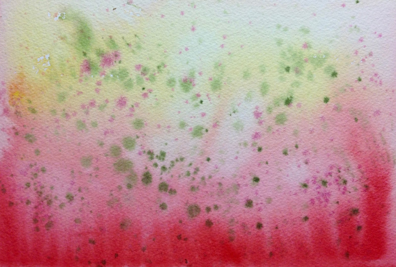
And what is the challenge?
To find an image in the abstraction. To me the green and red "spots" seemed to float through the air rather like specks of dust, pollen, or bits of plant and insect life catching the early morning sunlight. I was imagining the dawning of a day as seen from the ground and looking up.
Negative space painting was used in the bottom half of the painting giving a somewhat dreamy quality to the part of the earth still waking up.
Monday, October 23, 2017
Setting a Mood with Color

Snowy Splendor?
I recently completed two pieces for Onondaga Historical Association's Snowy Splendor: Winter Scenes of Onondaga County. Yes, in Central New York we've decided to stop complaining about our cold winters and instead celebrate our Snowy Splendor! Ok, not everyone has stopped complaining, and really, there's nothing you can do about the weather....hmmmm unless you are an artist! Then you can paint it, frame it, hang it up on the wall and have a party!
I've participated in this show for the last 4 or 5 years, each time submitting a painting of a different area of Onondaga County. Highland Forest, Green Lakes, Butternut Creek and Downtown Syracuse in the winter have all been subjects of previous paintings.
Cold Day
This year's entries are completely different in subject matter and in atmosphere. In Dickens Christmas Skaneateles, pictured above I've used a limited palette of cool blue, purple and rose tones, mixed with Payne's Gray. The resulting image feels cold, as it often is down by the lake. The only warm areas in the painting are around the focal point, which also happens to be the Dickens characters and the Christmas trim. Our eyes are drawn immediately to this area of warmth. The rose hues draw us into the painting and lead our eyes around the composition. Soft browns guide our eyes over the crowd and into the gazebo. Cool blues and Payne's Gray weave from the sky to the roof of the gazebo and down into the crowd, anchoring the composition.
Warm(er) Day

Baltimore Woods provides the setting for this piece which invites the viewer, or a solitary hiker to stop and pause for a while. The woods are quiet and snow covers much of the ground eliminating forest "clutter". The colors in this piece are very different form the Dickens painting. The rose and purple hues are warmer and color is much more saturated. Although we have strong verticals and diagonals in the picture the mood is still quiet and contemplative. The setting sun casts long purple shadows across the snow and the wooded area in the background is aglow with color. Bits of yellow sunlight play across the snow and a curving path through the tree leads us not just into the woods, but into a warm inviting area.
Color Temperature
In our paintings, color temperature can be used to our advantage in a few different ways. Using just a a warm or cool palette can unite a composition and lend a cohesive look to the final results. Color temperature can also help to set a mood and to tell a story. Think of an image painted primarily in cool blues and purples. How does that make you feel? Keep in mind that "cool" colors like blues also have warm and cool versions. Cerulean blue, Ultramarine blue and Thalo blue are all different in color temperature, ranging from warm to cool.
In a landscape color temperature often lets us know the time of day. Still life, portraits and other types of painting also benefit from color temperature's ability to set a mood. Subject matter is often the determining factor for how color temperature is used. A portrait of a charming, engaging person will most likely be painted in warm, inviting hues.
Cold Scene, Warm Colors
I like the challenge of painting a snowy winter scene using colors that are more warm than cool. And I like looking for the color in a season that is usually white or gray. The winter is full of color. We just need to see it.
 |
| "Leave Only Footprints" from Snowy Splendor 2015 |
For similar posts on painting the winter:
Tuesday, September 26, 2017
I Finished the Challenge!

I have finished the first painting from my challenge to the North Syracuse Art Guild last week.
In my demo, I painted an abstract watercolor background over a piece of crumpled tissue paper, which was placed over a sheet of wet watercolor paper. As the paint seeps through the tissue paper, interesting lines, crinkles and abstractions form. The challenge was to find a way to create a painting using the shapes that emerged from the abstraction.
I had used lots of warm colors and as soon as my tissue paper and watercolor paper were dry, I was able to pick out falling leaf shapes. And since it is Fall (although it's going to 92 degrees today), I guess I was somewhat influenced by the season, so leaves emerged from the abstraction.


The first photo is the abstract background. The second photo is the painting nearly done. Since this painting lacks a traditional focal point and resembles surface pattern more than a foreground, middleground , background type of composition, I needed to do something to draw the eye to a specific area.
So I used the rusty red color to create a path for the eye to follow. In the third picture the rusty red is darker and causes some of the major leave shapes to come forward, while creating a darker space for other leaves to recede into. I also added more leaves to enhance the pattern of falling leaves.

Happy painting everyone!
Tuesday, September 19, 2017
Thoughts on Creating Atmosphere
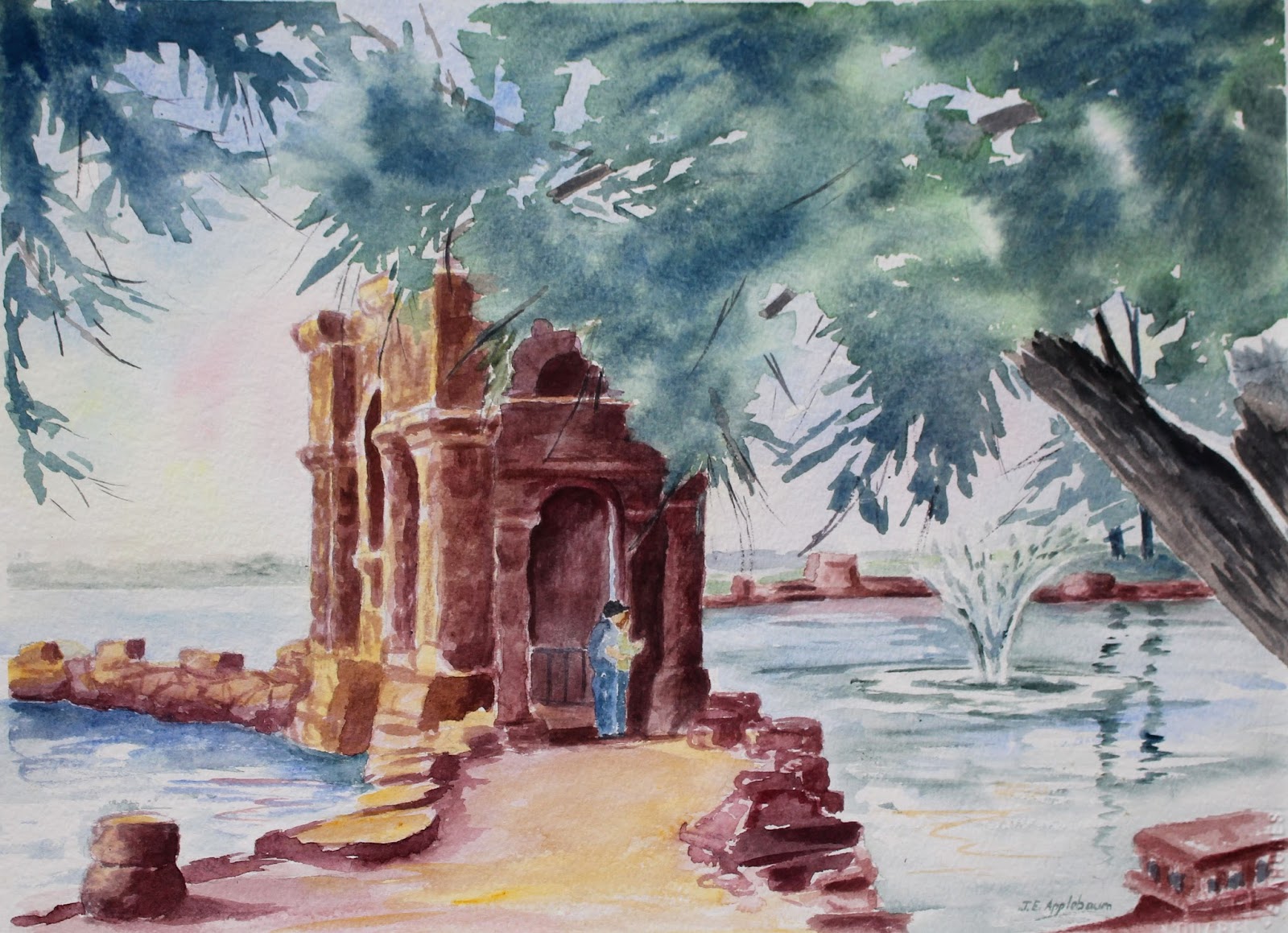
I will be presenting tomorrow for the North Syracuse Art Guild, so while I was putting these thoughts together, I figured I might as well add this to my blog!
CREATING ATMOSPHERE IN YOUR PAINTINGS
There are two ways to think about creating atmosphere in
your paintings. One is actual atmospheric conditions like fog, rain, early
morning light, or sunset and the other way is to create a sense of place.
Creating a sense of place tells us a story about the painting—like where it is
or what time of day. And often that other type of “atmosphere” helps to
embellish the story.
Know Your Subject
In creating atmosphere or a sense of place in your artwork
it really helps to know the place. I have always felt that I cannot paint a
scene until it has gotten under my skin. I’ve been very fortunate to have
traveled to many scenic places, but it is the paintings of places that I know
and love that turn out to be the most successful. And most often these
paintings are less about defining an actual scene and more about creating an
atmosphere or mood. It’s about understanding that kind of hot, hazy day when
the land and water are all blurry edges and color is soaked with sunlight,
nearly to the point of disappearing. Or an overcast day when the water and sky
are silvery gray shapes seamlessly merging together.
Over the last few years I’ve concentrated most of my
landscape painting to the St. Lawrence River and surrounding North Country. My
husband and I spend a lot of time at our place on Grass Lake in the Indian
River Lakes Region, which is very close to the Thousand Islands. The landscape
there, especially around the lake, has been a source of constant inspiration.
The St. Lawrence River is also an area that I have grown to love. There are
many painters on the River and one of the challenges I have had is in defining
a style to set myself apart from the rest of the painters. The castles,
lighthouses, iconic bridge and islands are painted over and over again.
Searching for a Style
In searching for a style I realized that painting
atmosphere, or a sense of place appealed to me so much more than painting Boldt
Castle as an illustration.


And so most of my paintings deal with misty mornings,
landforms and architecture partially obscured by fog, and impending storms
(summer and winter).
I use color and light to set a mood, and don’t really
concern myself with sticking to the colors in my reference photo or sketch. Color
used expressively is in my opinion so much more exciting than local color.
Shadows in deep blues, purples or reds add life to a painting. Skies can have
so many more colors than just blue or gray. Bits of pink and yellow, even green
can add so much depth to the sky
Leaving out distracting details is the hardest thing for me.
I have a tendency to paint too much detail. In creating that sense of
atmosphere it’s what we leave out rather than what we put in which engages the
viewer. It’s the suggestion rather than articulation of each object that we
strive for. In the acrylic painting below, I have painted just enough detail to
identify the location and added a wet pavement and dramatic sky to finish
“telling the story”.

In summary I would say that creating atmosphere or a sense
of place in your work comes from knowing and understanding your subject, using
color and light to convey mood and suggesting rather than fully illustrating
the subject.
Joan Applebaum, Windy Hill Studio
Find me on Facebook Joan Applebaum’s Windy Hill Studio
I teach classes at the Thousand Islands Arts Center and the
Sackets Harbor Arts Center in the Summer, and The Eye Studio in East Syracuse
in the Fall and Winter.
Sunday, August 6, 2017
Summer Paintings
 |
| "Grass Lake" |
June and July in Review
As we are slightly past the midway point for Summer I thought I would take some time to look over a few of the paintings I had created in the past few weeks.
The unique thing about this group of paintings is that they were each begun as a demo piece either for a class that I was teaching, or a demonstration of painting in a public setting.
Back in early June I was visiting friends who were staying on Blind Bay along the St. Lawrence River. On the day I was visiting the weather was less than perfect, intermittent rain fell for a good part of the afternoon. Not too great for kayaking, but I could see a painting coming to life. The soft rain and heavy skies created this dreamy setting, tucked away from the River in a world of its own. I took a few reference photos and a few days later while I was working at Bay House Artisans in Alexandria Bay I began the painting. As customers came into the store they would stop, watch my progress and make comments (mostly favorable!). I finished the painting later in my studio at camp.
 |
| "Rainy Day, Blind Bay" |
"Rising" was painted during Arts on Genesee, an outdoor Fine Art and Craft show. I blogged about painting that piece a few weeks ago.
http://joanapplebaumart.blogspot.com/2017/07/rising-watercolor-this-is-new-image.html
 |
| "Rising" |
 |
| "Sentry" |
 |
| "Grass Lake" |
Our first painting in the acrylic landscape class dealt with daytime light. Our second painting, done from our imaginations was a sunset painting. Skies and water come alive with color as the land becomes a silhouette.
 |
| "North Country Sunset" |
This coming week I will be detouring into "Painting on Silk", which is very much like watercolor. We'll see where the demos lead.
Subscribe to:
Posts (Atom)