Monday, November 13, 2017

It Started With an Exploding Watermelon.............


"Dawning" watercolor

Painting Challenge

Today's painting began as another of those challenges that I often give to a class or workshop. This one came from my watercolor class at The Eye Studio. We were working wet-on-wet color gradations (so in other words just letting our paint run from one end of the paper to the other---in this case bottom to top).As the paint made its way down the paper we added a light yellow, letting the colors bleed together. Then when the paper was still slightly wet we dropped bits of light green onto the paper. I also dropped bits of red paint.


So when mine was done it looked like the painting below. Since it looked like an exploding watermelon I had jokingly named it "Front Row Seats at the Gallagher Concert".


And what is the challenge? 

To find an image in the abstraction. To me the green and red "spots" seemed to float through the air rather like specks of dust, pollen, or bits of plant and insect life catching the early morning sunlight. I was imagining the dawning of a day as seen from the ground and looking up.
Negative space painting was used in the bottom half of the painting giving a somewhat dreamy quality to the part of the earth still waking up.


Friday, November 10, 2017

Cross-training in the Arts!


Kiln-Fused Glass Garden Sculpture

 PART 1

So..... I'm Cross-training......                                                                                              huh????

Cross-training is athletic training in sports other than the athlete's usual sport. The goal is to improve overall performance. It takes advantage of the particular effectiveness of one training method to negate the shortcomings of another. In business, companies will often cross train employees so that they gain an understanding of other parts of the business.

Lately I have been cross-training as well, but not in the usual way. No exercise machines or athletic regimens here in the art studio. Well I do participate in an exercise program three times per week and since it is dance-based, I am combining arts and athletics. So maybe that's how I've come to refer to my other forays into various media as cross-training.


So how does a painter cross-train? 

So how does a painter cross-train? Usually by working in other media to help enhance their skills. In all visual art forms we work with composition, color, value, line, form, shape, repetition, rhythm and emphasis. And sometimes when we work in the same media all the time we get a bit stale and need to spice things up. 

When I was teaching children's classes I worked in various media (paint, clay, wire sculpture, construction paper, crayons) and I found that whatever I was teaching to the children always influenced my personal artwork. And I was more experimental and willing to try new things because I was working with so many different types of art when I worked with young students.


Now that I'm not working with children I need to do a little something different every now and then to keep my ideas fresh. So I've been working with glass, which I love. Many years ago I created several stained glass pieces and loved the luminous quality of the light passing through colored and textured glass.

A little over a year ago I had an opportunity to learn kiln-fused glass techniques at the Eye Studio. I loved the way I was able to experiment with composition in such a tactile manner, moving glass pieces around until I was satisfied with the result. 

I made several functional pieces (bowls, trays, plates etc) and just a couple of decorative wall pieces. This is my first garden sculpture, and in this piece I have returned to a familiar subject for me: Land, Sky, Water. Many of my functional pieces are themed around a series I call "The Land Between the Waters".

I haven't broken away too much from the 2-dimensional format in this piece, but perhaps the next will be a little more 3-dimensional.

GLASS IS NOT THE ONLY WAY I CROSS-TRAIN

Stayed tuned for Cross-training Part 2.


Related Post: 

Monday, October 23, 2017

Setting a Mood with Color


Snowy Splendor?

I recently completed two pieces for Onondaga Historical Association's Snowy Splendor: Winter Scenes of Onondaga County. Yes, in Central New York we've decided to stop complaining about our cold winters and instead celebrate our Snowy Splendor! Ok, not everyone has stopped complaining, and really, there's nothing you can do about the weather....hmmmm unless you are an artist! Then you can paint it, frame it, hang it up on the wall and have a party!

I've participated in this show for the last 4 or 5 years, each time submitting a painting of a different area of Onondaga County. Highland Forest, Green Lakes, Butternut Creek and Downtown Syracuse in the winter have all been subjects of previous paintings.


Cold Day

This year's entries are completely different in subject matter and in atmosphere. In Dickens Christmas Skaneateles, pictured above I've used a limited palette of cool blue, purple and rose tones, mixed with Payne's Gray. The resulting image feels cold, as it often is down by the lake. The only warm areas in the painting are around the focal point, which also happens to be the Dickens characters and the Christmas trim. Our eyes are drawn immediately to this area of warmth. The rose hues draw us into the painting and lead our eyes around the composition. Soft browns guide our eyes over the crowd and into the gazebo. Cool blues and Payne's Gray weave from the sky to the roof of the gazebo and down into the crowd, anchoring the composition.

Warm(er) Day


Baltimore Woods provides the setting for this piece which invites the viewer, or a solitary hiker to stop and pause for a while. The woods are quiet and snow covers much of the ground eliminating forest "clutter". The colors in this piece are very different form the Dickens painting. The rose and purple hues are warmer and color is much more saturated. Although we have strong verticals and diagonals in the picture the mood is still quiet and contemplative. The setting sun casts long purple shadows across the snow and the wooded area in the background is aglow with color. Bits of yellow sunlight play across the snow and a curving path through the tree leads us not just into the woods, but into a warm inviting area. 


Color Temperature 

In our paintings, color temperature can be used to our advantage in a few different ways. Using just a a warm or cool palette can unite a composition and lend a cohesive look to the final results. Color temperature can also help to set a mood and to tell a story. Think of an image painted primarily in cool blues and purples. How does that make you feel? Keep in mind that "cool" colors like blues also have warm and cool versions. Cerulean blue, Ultramarine blue and Thalo blue are all different in color temperature, ranging from warm to cool.
   
In a landscape color temperature often lets us know the time of day. Still life, portraits and other types of painting also benefit from color temperature's ability to set a mood. Subject matter is often the determining factor for how color temperature is used. A portrait of a charming, engaging person will most likely be painted in warm, inviting hues. 

Cold Scene, Warm Colors

I like the challenge of painting a snowy winter scene using colors that are more warm than cool. And I like looking for the color in a season that is usually white or gray. The winter is full of color. We just need to see it.

 "Leave Only Footprints" from Snowy Splendor 2015

For similar posts on painting the winter:


Thursday, October 5, 2017

Looking for a Title for this Moody Painting!


Today's image, as yet untitled, is an experimental piece that I started a few weeks ago in my demo for the North Syracuse Art Guild. 

I have been using these small paintings as warm-ups for my Adding Atmosphere to Your Paintings Workshops and Classes. (I'm also using this method with my Intro Classes at the Eye Studio).
We start with diagonal strokes in moody Payne's Gray mixed with assorted blues and greens, add a touch of yellow ochre and a sun/moon on sloppy wet paper and just let it all flow. After the paint dries we look for inspiration in the shapes left behind. 
I've completed several of these pieces with landscape elements. This time I thought I would go for something a little different and added the stone walls leading into an ambiguous and somewhat spooky area. 
If anyone can think of a good title I'm open for suggestions.

"Sentry"

"Falling"

"Falling Snow, Rising Moon"

I've included some of the other paintings that started in this same way with diagonal strokes and moody colors over a wet surface.                                                                                                    

As you can see this method can take you in many different directions as you finish the piece.

In the painting "Sentry" I just added one of our herons from the lake and a suggestion of some sort of landform. "Falling" was finished after reading one of Rachael Ikins poems, and "Falling Snow, Rising Moon" became our holiday card image last year.

Tuesday, September 26, 2017

I Finished the Challenge!


I have finished the first painting from my challenge to the North Syracuse Art Guild last week. 

In my demo, I painted an abstract watercolor background over a piece of crumpled tissue paper, which was placed over a sheet of wet watercolor paper. As the paint seeps through the tissue paper, interesting lines, crinkles and abstractions form. The challenge was to find a way to create a painting using the shapes that emerged from the abstraction.


I had used lots of warm colors and as soon as my tissue paper and watercolor paper were dry, I was able to pick out falling leaf shapes. And since it is Fall (although it's going to 92 degrees today), I guess I was somewhat influenced by the season, so leaves emerged from the abstraction.


The first photo is the abstract background. The second photo is the painting nearly done. Since this painting lacks a traditional focal point and resembles surface pattern more than a foreground, middleground , background type of composition, I needed to do something to draw the eye to a specific area. 

So I used the rusty red color to create a path for the eye to follow. In the third picture the rusty red is darker and causes some of the major leave shapes to come forward, while creating a darker space for other leaves to recede into. I also added more leaves to enhance the pattern of falling leaves.


Happy painting everyone!

Tuesday, September 19, 2017

Thoughts on Creating Atmosphere


I will be presenting tomorrow for the North Syracuse Art Guild, so while I was putting these thoughts together, I figured I might as well add this to my blog!


CREATING ATMOSPHERE IN YOUR PAINTINGS


There are two ways to think about creating atmosphere in your paintings. One is actual atmospheric conditions like fog, rain, early morning light, or sunset and the other way is to create a sense of place. Creating a sense of place tells us a story about the painting—like where it is or what time of day. And often that other type of “atmosphere” helps to embellish the story.


Know Your Subject 

In creating atmosphere or a sense of place in your artwork it really helps to know the place. I have always felt that I cannot paint a scene until it has gotten under my skin. I’ve been very fortunate to have traveled to many scenic places, but it is the paintings of places that I know and love that turn out to be the most successful. And most often these paintings are less about defining an actual scene and more about creating an atmosphere or mood. It’s about understanding that kind of hot, hazy day when the land and water are all blurry edges and color is soaked with sunlight, nearly to the point of disappearing. Or an overcast day when the water and sky are silvery gray shapes seamlessly merging together.

Over the last few years I’ve concentrated most of my landscape painting to the St. Lawrence River and surrounding North Country. My husband and I spend a lot of time at our place on Grass Lake in the Indian River Lakes Region, which is very close to the Thousand Islands. The landscape there, especially around the lake, has been a source of constant inspiration. The St. Lawrence River is also an area that I have grown to love. There are many painters on the River and one of the challenges I have had is in defining 
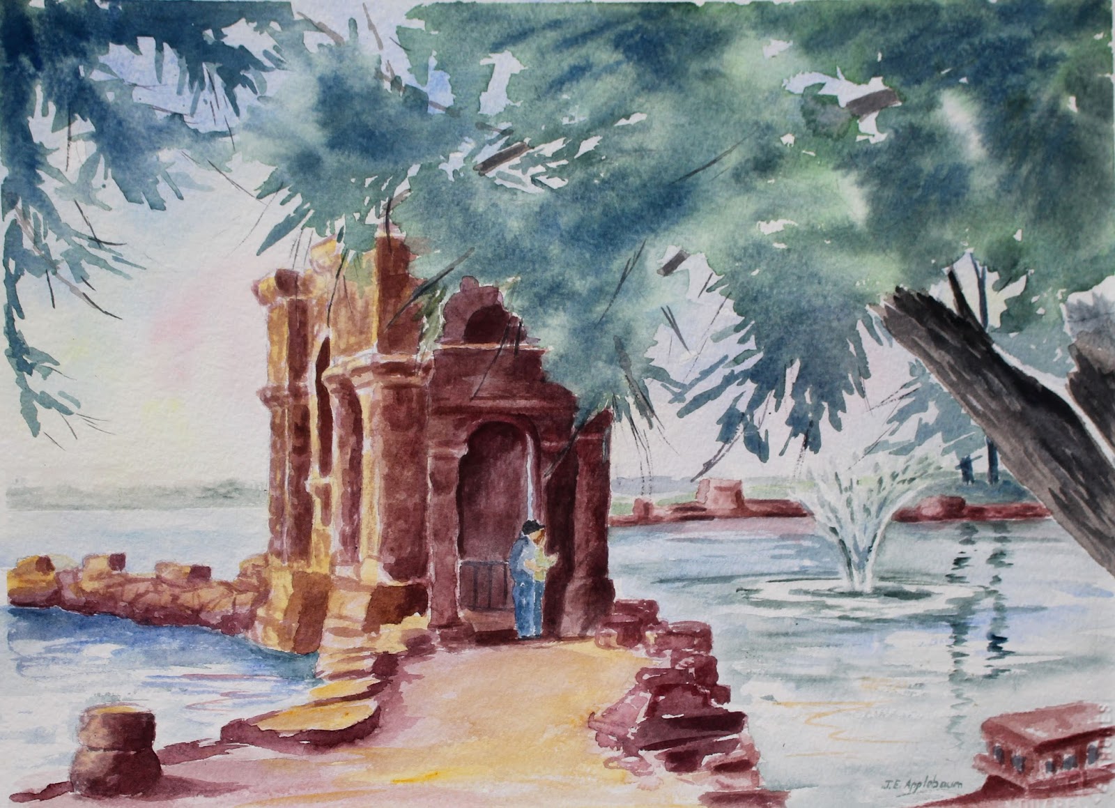
a style to set myself apart from the rest of the painters. The castles, lighthouses, iconic bridge and islands are painted over and over again.

Searching for a Style 


In searching for a style I realized that painting atmosphere, or a sense of place appealed to me so much more than painting Boldt Castle as an illustration.


And so most of my paintings deal with misty mornings, landforms and architecture partially obscured by fog, and impending storms (summer and winter).

I use color and light to set a mood, and don’t really concern myself with sticking to the colors in my reference photo or sketch. Color used expressively is in my opinion so much more exciting than local color. Shadows in deep blues, purples or reds add life to a painting. Skies can have so many more colors than just blue or gray. Bits of pink and yellow, even green can add so much depth to the sky


Leaving out distracting details is the hardest thing for me. I have a tendency to paint too much detail. In creating that sense of atmosphere it’s what we leave out rather than what we put in which engages the viewer. It’s the suggestion rather than articulation of each object that we strive for. In the acrylic painting below, I have painted just enough detail to identify the location and added a wet pavement and dramatic sky to finish “telling the story”.


In summary I would say that creating atmosphere or a sense of place in your work comes from knowing and understanding your subject, using color and light to convey mood and suggesting rather than fully illustrating the subject.


Joan Applebaum, Windy Hill Studio
www.windyhillstudioarts.com    joanapplebaumart@blogspot.com
Find me on Facebook Joan Applebaum’s Windy Hill Studio
I teach classes at the Thousand Islands Arts Center and the Sackets Harbor Arts Center in the Summer, and The Eye Studio in East Syracuse in the Fall and Winter.


Sunday, August 6, 2017

Summer Paintings


"Grass Lake"


June and July in Review

As we are slightly past the midway point for Summer I thought I would take some time to look over a few of the paintings I had created in the past few weeks.
The unique thing about this group of paintings is that they were each begun as a demo piece either for a class that I was teaching, or a demonstration of painting in a public setting.

Back in early June I was visiting friends who were staying on Blind Bay along the St. Lawrence River. On the day I was visiting the weather was less than perfect, intermittent rain fell for a good part of the afternoon. Not too great for kayaking, but I could see a painting coming to life. The soft rain and heavy skies created this dreamy setting, tucked away from the River in a world of its own. I took a few reference photos and a few days later while I was working at Bay House Artisans in Alexandria Bay I began the painting. As customers came into the store they would stop, watch my progress and make comments (mostly favorable!). I finished the painting later in my studio at camp.


"Rainy Day, Blind Bay"

"Rising" was painted during Arts on Genesee, an outdoor Fine Art and Craft show. I blogged about painting that piece a few weeks ago.
http://joanapplebaumart.blogspot.com/2017/07/rising-watercolor-this-is-new-image.html


"Rising"

In July I taught three 2-day workshops at the Thousand Islands Arts Center in Clayton. The first workshop, Foliage & Flowers left me with the beginnings of a really nice floral watercolor. I haven't finished it yet--it's next on my list. I also taught a class titled Creating Atmosphere in Your Watercolors. The small painting below "Sentry"came out of that class. We were working with heavy overcast skies and misty effects. I had really just meant to paint a sky but somehow a dreamy landform and a heron emerged from a puddle of Payne's Gray, Yellow Ocher and Cerulean Blue. The stark simplicity of the painting really appeals to me.


"Sentry"


"Grass Lake"
At the end of July I taught an Acrylic Painting class, concentrating on landscape. "Grass Lake" was under-painted on Monday, painted on Tuesday in class as a demonstration, finished that night in my studio at camp and sold on Wednesday. How's that for fast work???


Our first painting in the acrylic landscape class dealt with daytime light. Our second painting, done from our imaginations was a sunset painting. Skies and water come alive with color as the land becomes a silhouette.


"North Country Sunset"
So it seems that one of the perks of teaching and demonstrating is the opportunity to create a painting --maybe. Some of the pieces that I began as a demo for class turned out well. Others are opportunities for later. I have a couple of beach scenes and the afore mentioned floral painting to return to and perhaps a painting will emerge. Or perhaps these demos will become "studies" for a larger, more developed painting. And some demos just don't make it as paintings at all. All part of the learning process.

This coming week I will be detouring into "Painting on Silk", which is very much like watercolor. We'll see where the demos lead.


Monday, July 10, 2017

From Out of a Sloppy Wet Watercolor A Heron Rises


"Rising" watercolor


This is a new image, which I had started at Arts on Genesee at May Memorial back in June. 

I like painting when I am at a show, especially outdoor shows, because it engages the customers in conversation.

For this painting I had this idea of a heron rising from a swampy area, similar to the one at the end of our lake. I often see heron flying to and from that spot. I also wanted a moon rise, or sunset depending on how the viewer interprets the painting. So I lightly sketched the heron and then looked around for a large circle to trace. I ended up in the kitchen at May Memorial tracing a large platter for my moon/sun.
Then I headed back outside to my display and began a sloppy, drippy watercolor wash in orange-y yellow colors on the top, blues toward the bottom. There were a few people gathered around to see what I would do next. I had no idea.


Now What????

Then I laid crumpled plastic wrap over the wet paint to add texture by giving the paint places to pool into darker values.
Later I removed the wrap and was satisfied with the texture. I added a bit of extra color in some places to accentuate the irregular pattern. 

Finishing

The swampy areas were made the next day. I was working under a nice shady tree, listening to the musical entertainment and letting blues, greens and Payne's Gray run down my wet paper as I held the painting upside down. Wherever the colors ran into the orange areas, trees and tree stumps were formed. Little bits of some type of plant life was falling from the tree I was under, maybe a few bugs too--they all became part of the painting.
I finished the painting at home in my studio last week, no bugs or plant life in there, just two nosey cats looking at a picture of a bird. Yum.

"Rising" is the 5th in an ongoing series of Heron images.
"Early Riser" watercolor

"Heron" fabric dye and paint on silk


"Keeping a Lookout" watercolor

"Night Flight" watercolor